
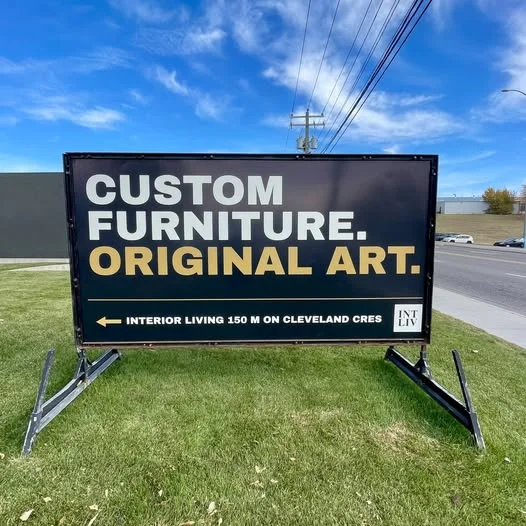
Portable sign advertising is one of the most direct, cost-effective outdoor marketing strategies available for local businesses. Positioned right at eye level along high-traffic corridors, temporary roadside signs and mobile mini-billboards capture the attention of thousands of commuters every day.
However, simply renting a roadside sign does not automatically guarantee foot traffic or phone calls. Many business owners unknowingly blunder their campaigns by treating portable signage like a print brochure or a digital landing page. When you clutter your display, choose the wrong placement, or ignore basic design principles, your marketing investment quickly turns into ignored visual noise.
To help you get the highest conversion rate out of your outdoor marketing campaigns, here are seven common portable sign advertising mistakes you must avoid—along with proven solutions to fix them.
Mistake 1: Message Overload – Trying to Tell Your Whole Story
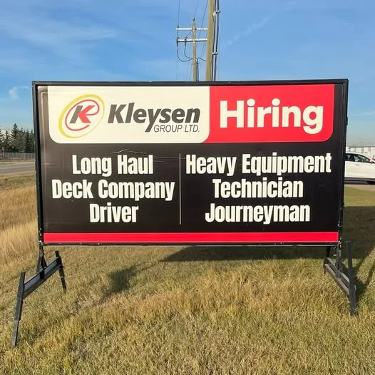
The single biggest mistake in mobile sign design is trying to say too much. Drivers passing by at 50 to 70 km/h have roughly three to five seconds to glance at your sign, process the message, and take mental note of your offer.
When you cram your company history, full street address, store hours, social handles, and a detailed bulleted list of services onto one board, readability plummets to zero. Passing traffic simply tunes it out.
The 3×5 Rule: How to Keep It Simple
To maximize legibility, follow a strict visual framework:
- The Hook: A 1 to 3-word bold headline that stops the eye (e.g., NOW OPEN, FLASH SALE, HUNGRY?).
- The Offer: A clear, concise benefit (e.g., 50% Off All Frames, Lunch Special $9.99).
- The Call to Action (CTA): A direct next step (e.g., Turn Right Here, Call Today).
As a rule of thumb, limit your layout to 3 lines of text and no more than 5 words per line—aiming for 7 words or fewer in total for vehicular traffic. Reviewing Sign Guru’s tips for simple outdoor sign design will give you a clearer idea of how minimalism directly drives higher foot traffic.
Mistake 2: Poor Visual Contrast and Stylized Typography
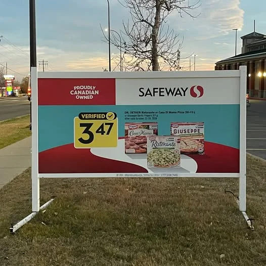
You might love a thin, elegant script font or a subtle, modern color palette on your computer screen, but outdoor lighting conditions change rapidly. Thin cursive fonts, low contrast (such as white text on a light gray background), or overly decorative typefaces disappear when viewed from 50 feet away in bright sunlight or at dusk.
High-Contrast Color Formulas That Work
Readability always trumps decorative style. Stick to high-contrast, bold, sans-serif typography. Proven outdoor color combinations include:
- Black text on a bright yellow background (highest visibility rating for moving traffic)
- White text on a deep navy or black background
- Bold red text on a clean white background
Ensure text height matches viewing distance: as a standard guideline, every 1 inch of letter height provides approximately 10 feet of clear visibility.
Mistake 3: Bad Placement and Line-of-Sight Blockages
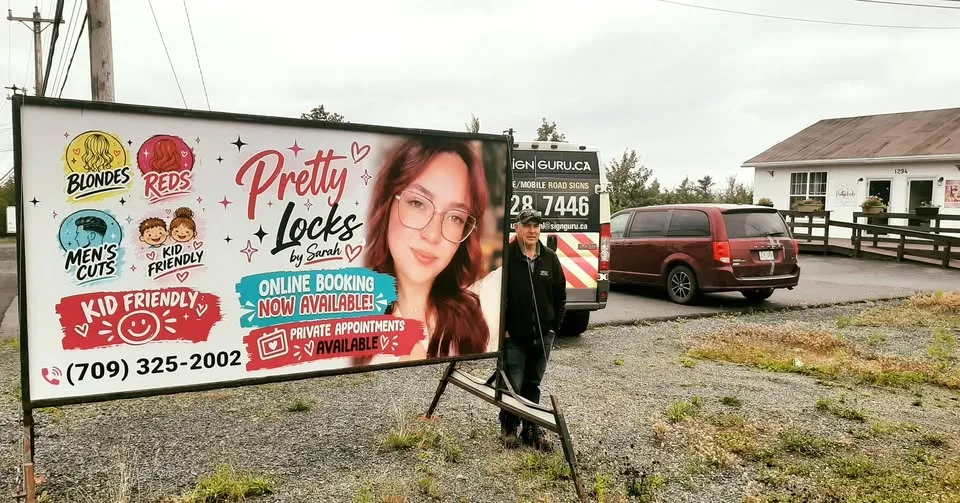
Even the most striking, professionally designed sign is useless if it is hidden behind parked vehicles, overgrown tree branches, utility boxes, or street furniture.
Another common placement flaw is positioning the sign parallel to the roadway rather than perpendicular or angled toward oncoming traffic flow. Parallel signs require drivers to turn their heads entirely sideways, dramatically reducing viewing time.
Always walk or drive the approach route yourself. Test sightlines from at least 100 yards away in both traffic directions to ensure your dual-sided display captures maximum attention without visual obstruction.
Mistake 4: Leaving Up Static Messages (Ignoring “Message Fatigue”)

Daily commuters travel the exact same routes every morning and evening. The first week your new mobile sign goes up, it commands attention. By week four, if the message has not changed, drivers experience “banner blindness”—their brains filter out the static graphic as familiar background scenery.
To maintain high response rates, rotate your roadside messaging regularly. Changing your offer, headline, or promotional focus every 7 to 14 days keeps your storefront looking active and gives local commuters a fresh reason to stop. Explore how quick graphic updates work by checking out Sign Guru’s mobile sign rental options, which allow seamless message rotations.
Mistake 5: Neglecting Local Bylaws and Permit Regulations
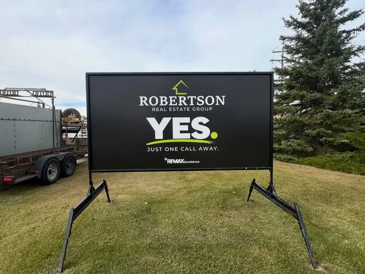
Every municipality maintains specific bylaws governing temporary mobile signage. Rules typically regulate setback distances from property lines, proximity to intersections or driveway sightlines, maximum sign square footage, and permit duration limits.
Setting up a portable sign without verifying local zoning compliance can lead to unexpected municipal fines or forced sign removal right in the middle of a major promotional push. Always partner with a sign provider that understands municipal regulations and manages the city permit process on your behalf. You can read standard legal and operational details on Sign Guru’s frequently asked questions page.
Mistake 6: Low-Quality Printing and Flimsy Substrates
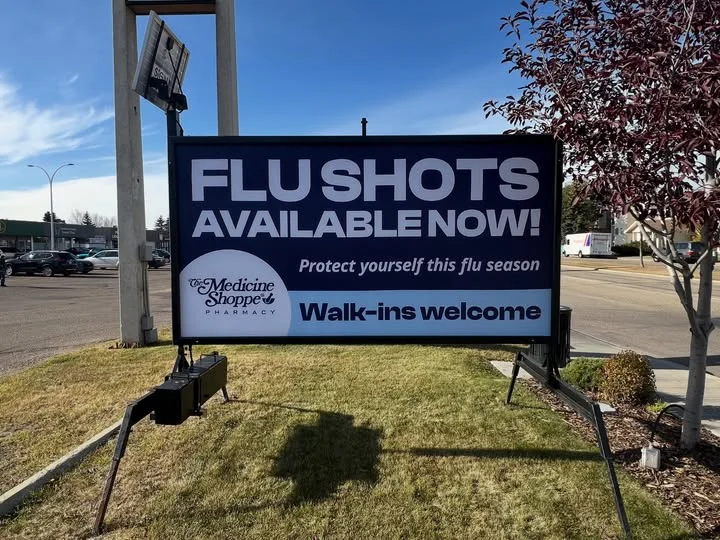
Your temporary signage is a direct visual reflection of your business quality. Faded colors, warped boards, peeling lettering, or flimsy frames damaged by heavy wind signal a lack of professionalism to potential customers.
Outdoor signage must endure harsh sunlight, rain, snow, and wind gusts without losing visual clarity. Ensure your provider uses rigid, weather-resistant substrates, high-resolution full-color digital printing, and protective UV laminates to keep your display crisp for the duration of your campaign. For deeper insight on how professional outdoor graphics withstand weather factors, review the signage durability guidelines from the International Sign Association.
Mistake 7: Forgetting a Single, Actionable Call to Action
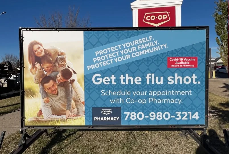
What exact step do you want the viewer to take after reading your sign? Many sign designs fail because they present a discount or announcement without telling the viewer how to act.
Avoid adding multiple competing contact methods like a phone number, long website URL, email address, and street address all at once. Drivers cannot write down a complex URL while driving. Choose one primary action:
- Directional: “Turn Right at Next Light”
- Immediate Visit: “Drive In – Walk-Ins Welcome”
- Direct Contact: “Call 555-0199” or “Scan QR Code Ahead” (for foot traffic)
Maximize Your Roadside Exposure with Professional Signage
Portable sign advertising remains one of the fastest ways to drive local awareness and generate immediate sales lift. By keeping your copy concise, selecting high-contrast designs, placing your sign in an unobstructed location, and rotating your offers regularly, you transform standard temporary signage into a high-converting marketing channel.
Avoid common DIY mistakes by working with experienced outdoor signage specialists. Contact Sign Guru today to explore custom, full-color portable sign rentals that capture attention and deliver real business results!