
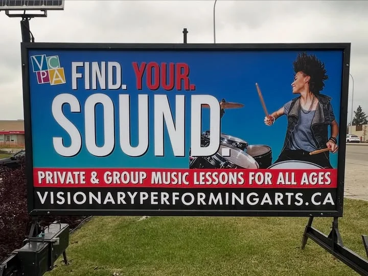
In street-level marketing, you have roughly 3 seconds to capture a driver or pedestrian’s attention. Portable signs—whether road signs, mini-billboards, mobile trailer signs, or pavement swinger boards—remain one of the most high-ROI local advertising channels available. However, a portable sign is only as effective as the message displayed on it.
If your lettering is too cluttered, confusing, or bland, potential customers will pass by without a second glance. Below is the ultimate guide to crafting the best portable sign messages, complete with high-converting message formulas, industry-specific examples, and proven copywriting practices designed to drive foot traffic and boost sales.
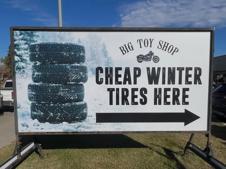
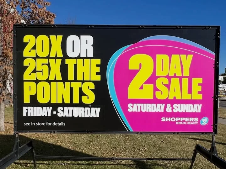
Why Message Strategy Matters for Portable Signs
Portable signage operates in a fast-paced environment where visual clutter is constant. Unlike digital ads or print flyers, roadside and sidewalk signs target audiences who are actively moving.
Because printed graphics offer much higher contrast and crispness than standard changeable letter tracks, using full-color mini billboard signs ensures your messaging can be read effortlessly at 50 mph.
A well-crafted portable sign message achieves three primary objectives:
- Interrupts visual monotony to grab instant attention.
- Communicates a singular, high-value proposition instantly.
- Triggers immediate action (driving into a parking lot or walking through the door).
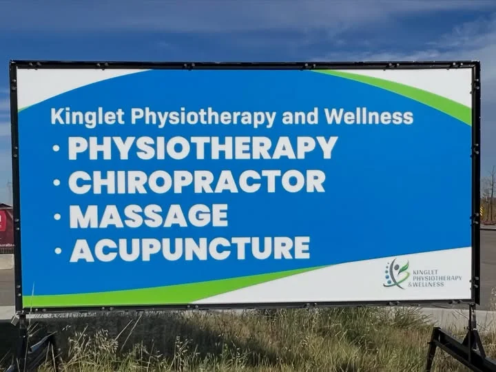
The Anatomy of a High-Converting Portable Sign Message
To maximize results, every sign message should follow a clear 3-part framework:
- The Hook: 1 to 3 words that stop the eye (e.g., NOW OPEN, FLASH SALE, HUNGRY?).
- The Offer: A clear, tangible benefit or discount (e.g., 50% Off All Frames, Lunch Special $9.99).
- The Call to Action (CTA): Clear instruction on what to do next (e.g., Turn Right Here, Step Inside, Scan QR Code).
High-Impact Portable Sign Message Examples by Category
1. Limited-Time Offers & Promotions
Scarcity creates urgency. Use these messages to drive immediate action for seasonal clearance or flash sales:
- “3-Day Clearance! Up to 50% Off Storewide”
- “Flash Sale Today Only – Buy 1, Get 1 Free”
- “Spring Clearance: Massive Savings Inside”
- “Weekend Special: Free Gift with Purchase!”
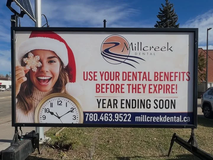
2. Service & Convenience Messaging
If your business solves an immediate problem or saves time, emphasize speed and accessibility:
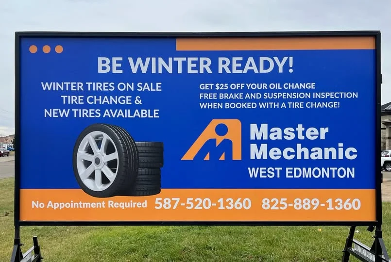
- “Walk-Ins Welcome – No Appointment Needed”
- “Oil Change in 15 Mins – Drive Right In”
- “Now Hiring! Apply Inside for Instant Interviews”
- “Need Tax Help? Free Consultations Today”
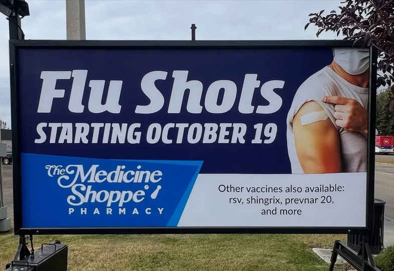
3. Food & Hospitality Hooks
For restaurants, cafes, and food trucks, sign messages should trigger appetite and convenience:
- “Hungry? Lunch Specials Starting at $8.99”
- “Fresh Coffee & Pastries – Drive-Thru Ahead”
- “Cold Beer, Hot Wings & Live Music Tonight”
- “Kids Eat Free Every Tuesday Night!”
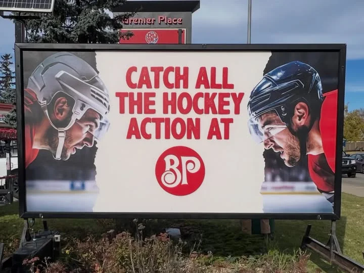
4. Curiosity & Humorous Sign Messages
Humor and wit create memorable impressions, making pedestrians stop to take pictures and share on social media:
- “Soup of the Day: The Tears of Our Competition”
- “Come In! We Have Air Conditioning and Bad Jokes”
- “Tacos Won’t Solve Your Problems, But It’s a Start”
- “Free Hugs (With Purchase of Any Latte)”
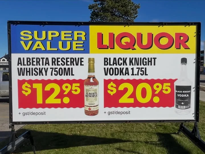
Proven Copywriting Rules for Portable Signage
Rule 1: The 3×5 Word Limit
Never overcrowd your portable sign board. A solid rule of thumb is to keep your text to no more than 3 lines of text, with no more than 5 words per line (15 words total, though 5 to 7 words is ideal for roadside vehicular traffic).
| Too Wordy (Avoid) | Concise & Direct (Best) |
| Come inside today to check out our end of season sale on all footwear items! | End of Season Sale – 40% Off All Shoes Today! |
| We offer full service automotive repair with fast turnaround times. | Fast Auto Repair – Walk-Ins Welcome Today |
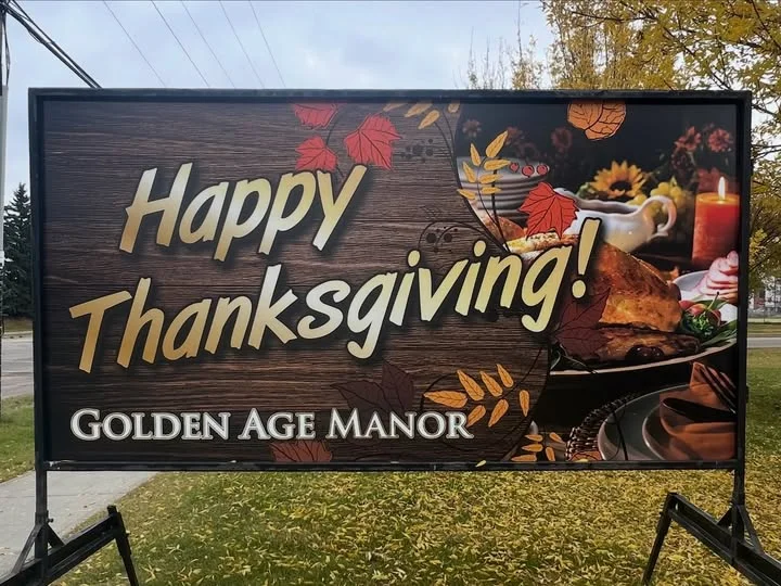
Rule 2: Prioritize High Contrast and Bold Fonts
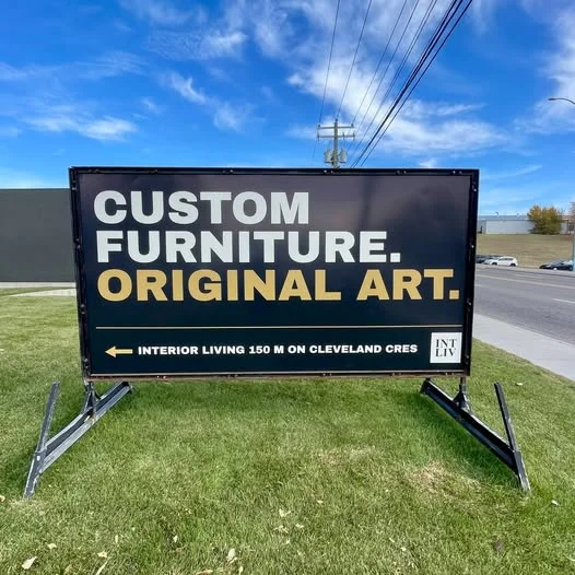
Typography and color choices dictate legibility. Always use high-contrast color combinations:
- Black text on yellow background (Highest visibility rating)
- White text on dark blue/black background
- Dark red text on white background
Avoid overly scripty or decorative fonts that are difficult to read at a glance. Stick to clean, sans-serif, bold block typography.
When choosing letter height and color contrast, adhering to established Federal Highway Administration sign legibility standards ensures your text can be detected, comprehended, and acted upon by drivers traveling at high speeds.
Rule 3: Rotate Messages Regularly
Message fatigue is real. Local commuters who drive past your business daily will eventually tune out a static message. Change your portable sign text every 1 to 2 weeks to keep the content fresh and give passersby a new reason to pay attention.
Essential Best Practices for Placement & Design
| Element | Best Practice |
| Viewing Angle | Position the sign perpendicular to oncoming traffic or foot traffic flow for maximum sightlines. |
| Letter Sizing | Use 1 inch of letter height for every 10 feet of viewing distance (e.g., 4-inch letters for 40-foot visibility). |
| Visual Hierarchy | Make your main headline 30% larger than the supporting text or CTA. |
| Digital Additions | For foot traffic signs, include a scannable QR code for mobile coupons or menu downloads. |
Frequently Asked Portable Sign Questions
High-contrast pairings like black text on a bright yellow background or white text on dark blue offer the best readability for drivers and pedestrians in all lighting conditions.
For vehicular traffic, keep the message between 5 and 7 words. For sidewalk A-frame signs targeting walking traffic, you can extend the message up to 12-15 words.
It is best practice to rotate your message every 7 to 14 days. Regular updates keep your marketing fresh and prevent local traffic from tuning out your sign.