
Mobile signs — also known as portable signs, trailer signs, or mini billboards—are one of the most powerful forms of local advertising. Positioned at street level and placed where traffic naturally flows, they deliver high visibility at a relatively low cost. However, simply renting a mobile sign isn’t enough. The real impact comes down to design.

An effective mobile sign design grabs attention in seconds, communicates a clear message, and motivates action—all while competing with traffic, buildings, and digital distractions. In this article, we’ll break down the key elements that make a mobile sign design truly effective and help your message stand out on the road.
1. Simplicity Is the Foundation of Great Mobile Sign Design
The most important rule of mobile sign design is also the simplest: less is more.
Unlike online ads or print brochures, mobile signs are viewed briefly—often by drivers moving at 50–70 km/h. That means your audience has three to five seconds to understand your message. Overloading your sign with text, images, or competing messages reduces readability and effectiveness.
An effective mobile sign design focuses on:
One main message
Minimal supporting text
Clean, uncluttered layout
Ask yourself: If someone only glances at this sign for two seconds, will they understand what I’m offering? If the answer isn’t a clear “yes,” the design needs to be simplified.
2. Strong, Clear Messaging Comes First
A mobile sign should communicate one primary goal. Whether you’re promoting a sale, announcing an event, or increasing brand awareness, the message must be immediately clear.
Effective messaging usually includes:
What you offer (product, service, or event)
Why it matters (benefit or incentive)
What to do next (optional call to action)
For example:
“Grand Opening – This Weekend”
“Now Hiring – Apply Today”
“Homes for Sale – Call Now”
Avoid vague slogans or clever wordplay that requires interpretation. Clever doesn’t always equal effective—clarity always wins.
3. Readable Fonts Are Non-Negotiable
Font choice can make or break a mobile sign. Since your audience is often in motion, legibility at a distance is critical.
Best practices for mobile sign typography include:
Use bold, sans-serif fonts
Avoid script, cursive, or decorative fonts
Limit designs to one or two fonts maximum
Ensure strong contrast between text and background
Thin lettering or overly stylized fonts may look good on a screen, but they often disappear when viewed outdoors. If your message can’t be read from across the street, the sign isn’t doing its job.

4. Color Contrast Drives Visibility
Color plays a major role in attracting attention and improving readability. High-contrast color combinations make text stand out against the background and help your sign cut through visual noise.
Effective color pairings include:
Black on yellow
White on blue
Red on white
Black on orange
Avoid low-contrast combinations such as light colors on light backgrounds or dark colors on dark backgrounds. Also be mindful of glare—very bright colors can reflect sunlight and reduce readability if not balanced properly.
Consistent brand colors are important, but visibility should always take priority in mobile sign design.
5. Size and Scale Matter More Than You Think
An effective mobile sign design is built for distance viewing, not close inspection. Text must be large enough to read from far away, especially for drivers approaching the sign.
General guidelines:
Headline text should be the largest element
Supporting text should be at least half the size of the headline
Phone numbers or URLs should be used sparingly and clearly
If your sign includes too many small details, it will fail in real-world conditions—even if it looks great on a computer screen.

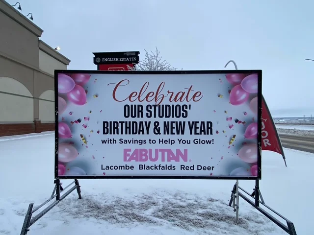
6. Strategic Use of Images and Graphics
Images can enhance a mobile sign, but only if they support the message rather than distract from it. A single strong visual can reinforce what you’re advertising, while multiple images often create confusion.
When using images:
Choose high-resolution graphics
Use one clear focal point
Avoid detailed photos that don’t read well at a distance
Icons, logos, or simple symbols often work better than photos, especially for service-based businesses. Remember, your image should complement your message—not compete with it.
7. Placement and Orientation Influence Design
Effective mobile sign design considers where and how the sign will be displayed. Traffic direction, viewing angles, and surroundings all affect readability.
Design considerations include:
Horizontal vs. vertical layouts
Left-to-right reading flow based on traffic direction
Avoiding cluttered backgrounds like trees, fences, or busy buildings
A great design can lose impact if it isn’t optimized for its placement. Professional sign providers often help adjust designs based on real-world positioning to maximize results.

8. A Clear Call to Action (When Appropriate)
Not every mobile sign needs a call to action, but when the goal is lead generation or immediate response, a simple CTA can significantly improve performance.
Effective CTAs include:
“Call Today”
“Visit Us”
“Apply Now”
“This Weekend Only”
Keep CTAs short and easy to understand. Avoid adding phone numbers or website URLs unless there is enough space to make them clearly readable at a distance.
9. Brand Consistency Builds Recognition
Mobile signs are powerful branding tools when used consistently. Using the same colors, fonts, and logo across multiple signs builds familiarity and trust over time.
An effective mobile sign design:
Aligns with your overall brand identity
Reinforces recognition through repetition
Looks professional and polished
Even when promoting short-term offers, maintaining brand consistency helps turn quick impressions into long-term awareness.

10. Professional Design Delivers Better Results
While DIY designs may seem cost-effective, professionally designed mobile signs often perform better. Experienced designers understand scale, contrast, typography, and real-world viewing conditions.
Professional design ensures:
Maximum readability
Better message hierarchy
Stronger visual impact
Higher return on advertising investment
When combined with strategic placement, a professionally designed mobile sign can outperform many digital and traditional advertising methods.

Final Thoughts
An effective mobile sign design is not about cramming in information—it’s about communicating clearly, quickly, and confidently. By focusing on simplicity, readability, strong contrast, and strategic messaging, mobile signs can capture attention where it matters most: on the street.
Whether you’re promoting a business, event, or special offer, investing in a strong mobile sign design ensures your message isn’t just seen—but remembered.