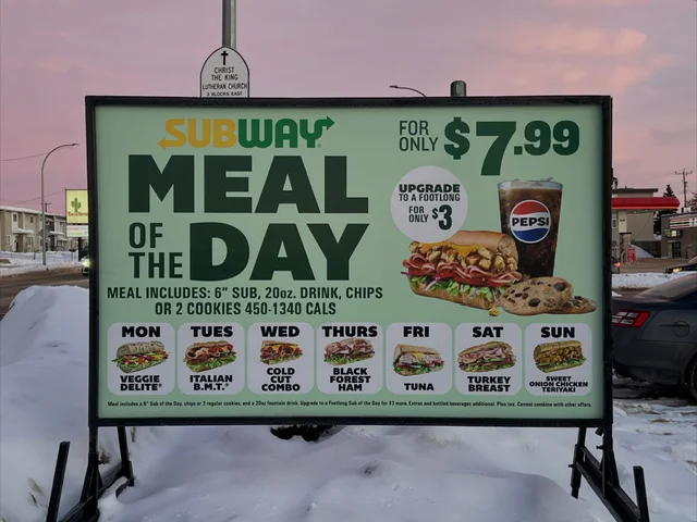
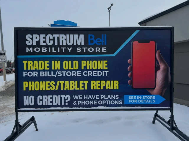
Portable billboard advertising is one of the most powerful ways for local businesses to grab attention in high-traffic areas. Whether your message is placed on a roadside, in a parking lot, or along a busy commuter route, your sign has only a few seconds to make an impact. Two of the most critical factors in that split-second decision are font size and color choice.
If your text is too small or your colors lack contrast, even the best offer can be completely overlooked. In this article, we’ll break down the best font sizes and color combinations for portable billboard advertising—and explain how to design signs that are readable, eye-catching, and effective.

Why Font Size and Color Matter in Portable Billboard Advertising
Portable billboards are typically viewed by people driving or walking past at varying speeds and distances. Unlike digital ads or print materials, viewers cannot stop and study your sign. Research consistently shows that drivers have three to five seconds to read a roadside message before it disappears from view.
This makes legibility essential. The right font size and color scheme help ensure:
- Faster comprehension
- Higher recall
- Improved response rates
- Better return on advertising spend
A well-designed portable billboard doesn’t just look good—it communicates instantly.
Best Font Sizes for Portable Billboard Advertising
The Distance Rule: Size Matters
A common rule of thumb in outdoor advertising is:
Every 1 inch of letter height = 10 feet of readable distance
Using this formula helps determine how large your text should be based on where your sign is placed.
Portable Billboard

Recommended Font Sizes by Viewing Distance
30–50 feet (parking lots, sidewalks, slow traffic):
- Minimum letter height: 3–5 inches
- Best for phone numbers, URLs, or short calls to action
50–100 feet (city streets, moderate traffic):
- Minimum letter height: 6–10 inches
- Ideal for headlines and key messages
100–200 feet (busy roads, highways):
- Minimum letter height: 12–24 inches
- Best for bold headlines and brand names
For portable billboards, the main message should be readable from at least 100 feet away. Supporting text should be limited and secondary.

Headline vs. Supporting Text
Your sign should follow a clear hierarchy:
- Headline (largest text): Business name, offer, or primary message
- Secondary text: Short supporting phrase or benefit
- Call to action: Phone number, website, or location
A strong rule is:
- Headline text should be at least 2–3 times larger than any secondary text
- Avoid using more than two font sizes on one sign
Simplicity increases readability and effectiveness.
Best Fonts for Portable Billboards
Not all fonts perform well outdoors. Decorative or script fonts may look stylish but are often difficult to read at a distance.
Best font styles for portable billboard advertising:
- Sans-serif fonts (Arial, Helvetica, Futura, Open Sans)
- Bold, clean lettering
- Even spacing between letters
Avoid:
- Thin fonts
- Script or cursive fonts
- All caps in long sentences (use sparingly for emphasis)
Best Color Choices for Portable Billboard Advertising
Portable Billboards

High Contrast Is the Priority
Color contrast is even more important than color preference. High contrast allows text to stand out clearly against the background, especially in varying light conditions.
Top high-contrast combinations include:
- Black text on a yellow background
- White text on a dark blue or black background
- Red text on a white background
- Black text on a white background
These combinations are proven to deliver fast readability and strong visibility.

Background Colors That Perform Best
Yellow
- One of the most visible colors in outdoor advertising
- Highly effective in daylight
- Often used for caution signs due to quick recognition
White
- Clean, professional, and versatile
- Works well with dark text
- Can be affected by glare in bright sunlight
Dark Blue or Black
- Excellent contrast with white or yellow text
- More legible at night
- Conveys authority and professionalism
Text Colors That Grab Attention
Black
- Maximum readability
- Works with almost any background
White
- Ideal for dark backgrounds
- Excellent night visibility
Red
- Creates urgency and emotional impact
- Best used for headlines or calls to action
- Should always be paired with a neutral background

Avoid Overuse of Bright Colors
Neon colors, multiple bright hues, or gradients may look appealing up close but often reduce readability at a distance.
How Lighting and Weather Affect Color and Font Choices
Portable billboards are exposed to changing light conditions, weather, and seasons.
Daylight Considerations
- Sun glare can wash out light colors
- High-contrast combinations are essential
- Matte finishes reduce reflection
Nighttime Visibility
- White or yellow text on dark backgrounds performs best
- Avoid dark text on dark backgrounds
- Ensure reflective or illuminated elements where possible
Weather and Seasonal Changes
- Snow reduces contrast for white backgrounds
- Rain and fog reduce visibility
- Bold fonts and strong colors maintain clarity in poor conditions
Common Mistakes to Avoid
Many portable billboard campaigns underperform due to design errors, including:
- Too much text
- Fonts that are too small
- Low contrast color combinations
- Using more than three colors
- Cluttered layouts with no visual hierarchy
Remember: If it can’t be read in three seconds, it won’t be read at all.

Best Practices for Portable Billboard Design
To maximize effectiveness:
- Limit text to 6–10 words
- Use one strong message
- Choose one background color
- Stick to one or two fonts
- Prioritize readability over creativity
Portable billboards work best when they deliver a simple, bold message quickly.
Final Thoughts: Design for Speed and Simplicity
The best font sizes and colors for portable billboard advertising are not about trends—they’re about visibility, clarity, and speed. Large, bold fonts paired with high-contrast color combinations ensure your message is seen, understood, and remembered.
When designed correctly, portable billboards become powerful marketing tools that drive brand awareness, foot traffic, and sales—day and night.
If you want your portable billboard advertising to work harder, start with the fundamentals: big text, bold colors, and a clear message.
